Login to leave a comment.
UX/UI Design
When you think of design, what comes to mind?
For many, it’s color, imagery, or layout. But there’s an unsung hero quietly shaping how we experience the world: typography. Whether you’re reading a book, browsing a website, or glancing at a street sign, typography is at work, guiding your eyes and influencing your emotions.
What Is Typography?
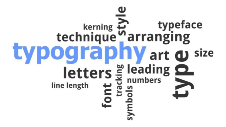
At its core, typography is the art and technique of arranging type. It involves choosing typefaces, point sizes, line lengths, spacing, and letterforms to make written language legible, readable, and visually appealing.
Typography isn’t just about making text look pretty—it’s about communication. The right typography can make content easier to understand, more engaging, and even more persuasive.
A Brief History
Typography’s roots stretch back to the invention of movable type by Johannes Gutenberg in the 15th century. This revolutionized the way information was shared, making books and newspapers accessible to the masses. Over the centuries, typography has evolved alongside technology, from hand-set metal type to digital fonts and responsive web design.
Why Typography Matters
First Impressions Count
The typeface you choose sets the tone. Imagine receiving a wedding invitation in Comic Sans or reading a legal contract in a playful script font. Typography instantly communicates mood, professionalism, and intent.
Readability and Accessibility
Good typography ensures that your message is easy to read. Factors like font size, line spacing, and contrast all play a role in making text accessible to everyone—including people with visual impairments.
Brand Identity
Typography is a key element of branding. Think of Coca-Cola’s flowing script or the bold simplicity of Google’s logo. Fonts become synonymous with brands, evoking recognition and trust.
Emotional Impact
Different typefaces evoke different feelings. Serif fonts like Times New Roman suggest tradition and reliability, while sans-serif fonts like Helvetica feel modern and clean. Script fonts can be elegant or whimsical, depending on their style.
Elements of Typography
Typeface vs. Font: A typeface is a family of fonts (like Arial), while a font is a specific style and size within that family (like Arial Bold, 12pt).
Hierarchy: Using different sizes, weights, and styles to guide the reader’s eye and emphasize important information.
Alignment: How text is positioned on the page—left, right, centered, or justified.
Spacing: Includes kerning space between letters, leading space between lines, and tracking overall spacing across a word or line.
For Better Typography
Limit Your Fonts: Stick to two or three typefaces per project for a cohesive look.
Prioritize Legibility: Don’t sacrifice readability for style. Make sure your text is easy on the eyes.
Use Hierarchy: Guide your reader with clear headings, subheadings, and body text.
Mind the Details: Pay attention to spacing, alignment, and consistency.
Test Across Devices: Make sure your typography works well on both desktop and mobile screens.
Typography in the Digital Age
With the rise of web and app design, typography has become more dynamic than ever. Variable fonts, responsive type, and accessibility standards are shaping the future of how we read and interact with text online.
Final Thoughts
Typography is everywhere, yet often goes unnoticed—until it goes wrong. By understanding the basics and appreciating its impact, you can elevate your designs, strengthen your message, and create a more enjoyable experience for your audience.
So next time you pick a font, remember: you’re not just choosing letters. You’re choosing how your message will be seen, felt, and remembered.
0 comments
No comments yet. Be the first to comment!