

Design tokens, not components, survive your next redesign
Most design systems get rebuilt twice because components own decisions they should never have owned. The three-layer token model, the generated build that keeps Figma and code honest, and the ratchet that migrates a live UI.
Most design systems get built twice. The first version ships as a component library — Button, Input, Card, Modal — and it earns its keep for about a year and a half. Then the brand refresh lands, or the admin app needs a dark mode, or a second product wants the same UI. That is the week everyone discovers that the thing they built for reuse was only reusable inside one visual language.
The teams that skip the second rebuild almost always converged on the same move: they pushed design tokens underneath the components and made the components stop making decisions. The tokens carry the values, the semantics carry the meaning, and the components carry nothing but structure. When the redesign arrives, the button does not change. Only the alias underneath it does.
The unit of reuse is wrong
Two years in, a component library looks like this: a Button with fourteen props, nine variants and a style escape hatch three teams use, and a palette living in theme.ts, a Tailwind config, four Figma files and a #2563eb somebody typed into a landing page in 2024.
The failure is not laziness. A component bundles structure, behaviour and appearance — three things with completely different rates of change. Bind them together and every visual change becomes a code change in a component forty screens depend on.
The rename test is the cheapest diagnostic. Rename the brand colour from blue to a warmer blue. In a token-first system, one line changes in tokens.json. In a component-first system, you grep for hex codes, find 300 hits, and discover that twelve of them were deliberately not the brand colour. Now you need to know why each one existed, and the person who wrote them left in March.
What a token actually is
A token is a named decision — not a variable, not a Tailwind class, but a decision with a name that a build step can read. The distinction that matters is which layer it belongs to, and most broken token systems shipped only one.
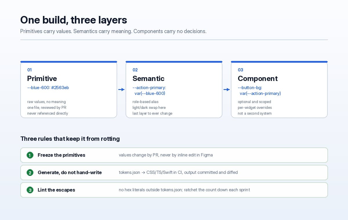
Primitives hold raw values and no meaning: blue-600, space-4, radius-2. Semantics hold roles and point at primitives: action-primary, surface-raised, text-muted. Components hold one widget's local scope, and only when the widget genuinely needs to differ.
{
  "color": {
    "blue-600":      { "value": "#2563eb", "type": "color" },
    "blue-300":      { "value": "#93b4fd", "type": "color" }
  },
  "semantic": {
    "action-primary": { "value": "{color.blue-600}", "type": "color" },
    "action-primary-hover": { "value": "{color.blue-600}", "type": "color", "dark": "{color.blue-300}" },
    "text-muted":     { "value": "{color.slate-500}", "type": "color" }
  },
  "component": {
    "button-padding-x": { "value": "{space.3}", "type": "spacing" }
  }
}
Three layers, one direction of reference. Primitives never point at semantics. Components may point at semantics. Nothing points up. The moment you allow blue-600 to reference action-primary, you have created a cycle and the build will either crash or, worse, resolve inconsistently between outputs.
Components that contain no colour
Once the semantic layer exists, a component becomes almost boring — which is the point. Compare the two versions of a button's style block.
/* Before: the component owns the decisions, so it owns the redesign */
.btn-primary { background: #2563eb; color: #fff; padding: 10px 18px; border-radius: 6px; }
.btn-primary:hover { background: #1d4ed8; }

/* After: the component declares intent; the token layer supplies values */
.btn-primary {
  background: var(--action-primary);
  color: var(--text-on-action);
  padding: var(--button-padding-y) var(--button-padding-x);
  border-radius: var(--radius-control);
}
.btn-primary:hover { background: var(--action-primary-hover); }
The second version is not shorter by accident. It has no values to be wrong. The dark theme is not a second stylesheet — it is the same stylesheet with different alias resolution, because action-primary points at blue-300 in the dark block and blue-600 in the light one. That single property kills the class of bug where a new screen ships with white cards on a dark background, because nobody had a reason to hardcode anything.
It also deflates the variant explosion. Nine variants usually mean nine tangled combinations of colour, size and icon; with tokens those become independent axes, and a tenth "variant" is often just a semantic alias.
One source of truth, one generated build
The Figma handoff is where token systems quietly fork into two truths. The fix is mechanical: one input file, many generated outputs, all committed.
# tokens.json is the only file a human edits.
# Everything below it is generated and diffed in CI.
python tools/build-tokens.py \
  --in design/tokens.json \
  --out-css src/styles/tokens.css \
  --out-ts  src/design/tokens.ts \
  --out-ios ios/Sources/DesignTokens.swift
Two rules make this survive contact with a team: the generated files are committed, not built at deploy time, so a token change appears as a readable diff; and CI fails if a rebuild changes the working tree.
python tools/build-tokens.py --check # exits 1 if output != committed output
It catches the commonest real-world failure: somebody edits tokens.css directly because it was faster at 7pm. Next morning the change is promoted into tokens.json or reverted — there is no third option, and that ambiguity is what kills token systems.
For platforms that cannot read CSS variables — React Native, Swift, Compose — the same JSON emits typed constants. Worth doing even for one platform: it forces aliases to have stable names instead of var(--blue-600) in JSX.
The five ways token systems die
1. The semantic layer is skipped. Ship primitives, call it done, and let components reference --blue-600. It works until dark mode, when every component needs a conditional and you are back to a component library with extra steps.
2. Tokens are named after appearance, not role. --light-blue-bg and --gray-border describe the current design. The moment a border becomes a two-pixel line or the grey becomes warm, the names lie and people stop trusting them. --surface-raised and --border-subtle survive a redesign; the others do not.
3. Modes fight over the same alias. Dark mode is not a colour inversion. Override primitives and you will find shadows, borders and focus rings all need different treatment than naive inversion gives. Switch modes in the semantic layer only, and audit the aliases that cannot simply swap — usually elevation and focus.
4. One giant CSS file, loaded everywhere. Custom properties are cheap, but a 900-variable stylesheet in every bundle is not, and it becomes unreadable. Split by concern — colour, space, type, motion, elevation — and generate per-platform subsets.
5. There is no deprecation path. Old aliases must keep working while code migrates, but "forever" is how you accumulate four names for the same grey. Mark it deprecated in the JSON, count usages in CI, delete at zero.
A migration that does not stop the roadmap
Rewriting a live UI in one branch is a fantasy. The version that works is a ratchet: every sprint the number of hardcoded values goes down and never goes up.
- Inventory first, decisions second. Grep for hex codes, px values and font sizes. A mid-size product surfaces 30-60 colours, 8-15 radii and a dozen font sizes nobody chose on purpose. Picking 12 of them is a product decision, and it needs the designer in the room.
- Instrument the escapes. Add a lint rule that flags hex literals,
rgb(, and arbitrarypxoutside the token layer. Start it as a warning with the current count frozen in a file. - Make the ratchet fail the build. CI asserts
count <= recorded_count. New violations fail immediately; existing ones are burned down opportunistically, by the people already touching that screen. - Codemod the mechanical cases. Replacing
#2563ebwithvar(--action-primary)is a script, not a week of human labour. Regex is enough for exact hex matches; leave the ambiguous ones for a human. - Freeze the old theme. Once
theme.tshas no importers, delete it in the same PR that removes the last one. Zombie theme files are re-adopted within a quarter, every single time.
The cost, honestly
Tokens are not free. You gain a build step that can break, a generated layer someone will be tempted to edit, and an extra indirection when debugging in DevTools — var(--action-primary) resolves to a value you cannot read without clicking through. Hundreds of custom properties in scope also cost measurably more style recalculation on a low-end Android device than literals do, though real dashboards rarely notice.
The honest threshold: if the product has one brand, one theme, no plans for a second surface, and fewer than about twenty screens, a small constants.ts and a code review rule is enough. Tokens earn their build step when any of these is true — a second theme, a second platform, a design team that works in Figma independently of engineering, or a design refresh inside the next two years. For most products we build at NetPy, at least two of those are true on day one.
If you are training engineers to own this layer, the frontend track in our FDE programme covers exactly this — component APIs, token pipelines and the review discipline that keeps them honest.
What survives
The test of any design system is not how it looks in the first year. It is what a redesign costs in the third. A component library makes the first build fast and every subsequent visual change expensive. A token layer costs you a week up front and then turns the redesign into a diff to one JSON file, one generated output, and a release note.
The components are the disposable part. The tokens are what survives — provided you name them after meaning, generate rather than hand-write them, and never let a hex code back into a component.
Header photo: "Paint Swatch" by Iroc8210, CC BY-SA 3.0, via Wikimedia Commons.